Here’s My Favorite Way To Start a Floral Design
Color! Struggles with color when designing florals are often painterly ones. How can we pair and blend colors that compliment each other? One red looks harsh against another blue, or clashes with a yellow. Where do we begin with so much color choice? If the goal is to create an arrangement that is harmonious and pleasing to the eye (and whose isn't!), working in analogous color is the answer. It also happens to be my favorite way to design.
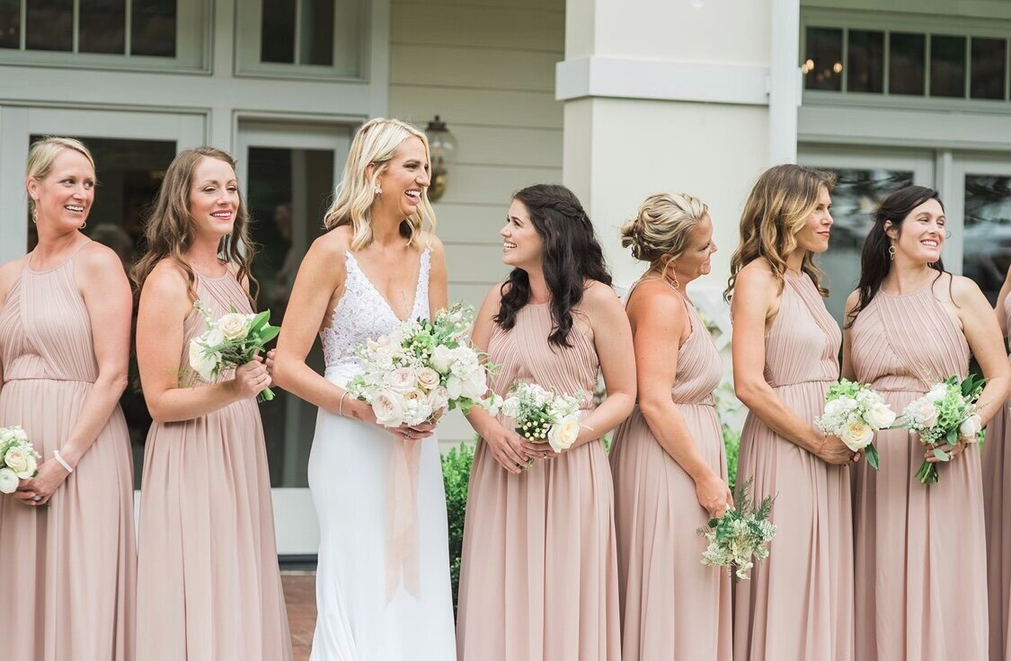
People use the words "tonal" or "monochromatic" or "analogous" when describing this color method. Despite the terminology, it's best described as using shades, tints and tones of a single color, or colors that are within a 90 degree angle on the color wheel. For instance, blending light and dark pinks, or deep and bright purples. So how does this work in a practical sense?
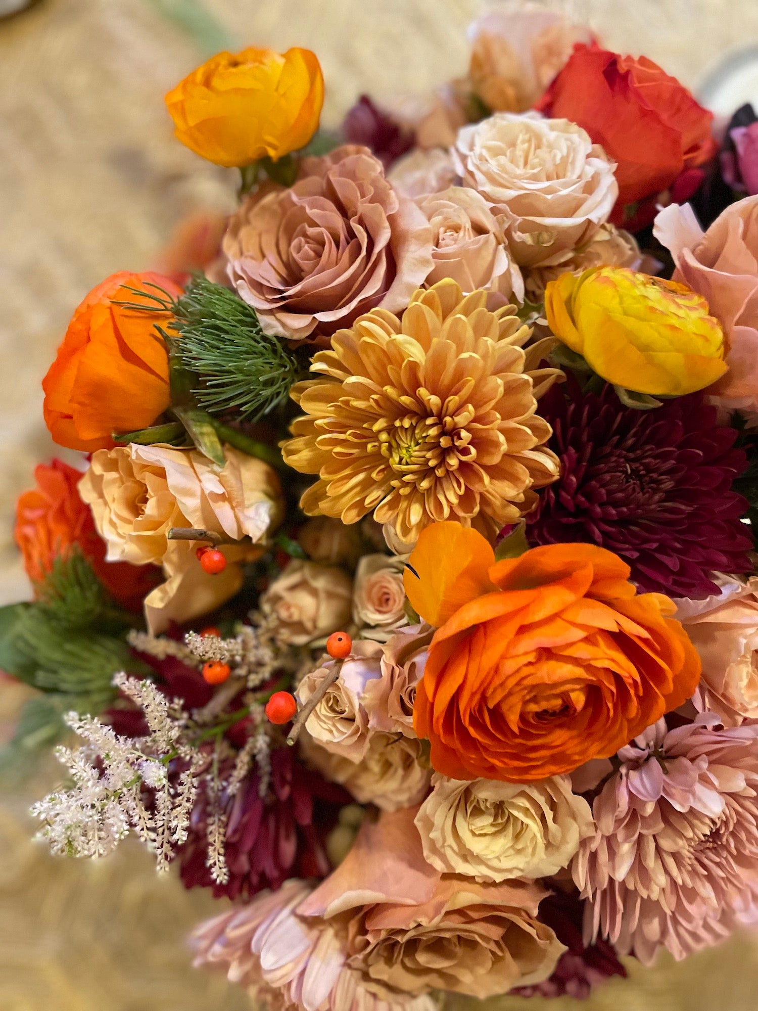
 First, choose a color. Then, choose a flower in that color that strikes you as beautiful. At first glance, the array of "orange" flowers that are available to you may all look the same shade, or close to it. But if you really examine the flower, and I mean get into the petals and stamens and stems, it is actually a myriad of tints, tones and shades. Light to dark, intense to muted. And pulling from each of those particular nuances to make your next choice of bloom is how you harmonize. It also forces you to look more closely at the incredible intricacy of a single flower - nature made!
Look at a single petal of a pink dahlia for example (dahlias are a great choice to play with this analogous color method). The petal is not a solid color. There are tints of light and dark and tones of purple and yellow. These tints and tones then inform the materials that I select next. So, choosing that first flower really becomes the largest influence on the overall floral piece. Looking at your garden, or the floral department of Trader Joe's, what color are you drawn to first? Take that and pick up all of the shades within it to blend your arrangement.
I find this way of designing a fun challenge and also rather foolproof when it comes to creating beauty. Analogous color always feels most comfortable and organic to the eye – perhaps because it mimics what we find in nature. Think of the subtlety of shade and tone in the “blue” ocean or “green” field. Color in nature is much more dimensional than a jumble of crayons; you see a forest and appreciate all the browns, or love a snow scene for its blanket of whites.
This way of design simplifies your choices and at the same time, allows you to make a big impact. It evokes the incredible variations in one color that nature provides. Without realizing, your eyes move seamlessly across the color scheme, appreciating the depth and beauty of the whole.
I hope you'll give it a try.
People use the words "tonal" or "monochromatic" or "analogous" when describing this color method. Despite the terminology, it's best described as using shades, tints and tones of a single color, or colors that are within a 90 degree angle on the color wheel. For instance, blending light and dark pinks, or deep and bright purples. So how does this work in a practical sense?
Look at a single petal of a pink dahlia for example (dahlias are a great choice to play with this analogous color method). The petal is not a solid color. There are tints of light and dark and tones of purple and yellow. These tints and tones then inform the materials that I select next. So, choosing that first flower really becomes the largest influence on the overall floral piece. Looking at your garden, or the floral department of Trader Joe's, what color are you drawn to first? Take that and pick up all of the shades within it to blend your arrangement.
I find this way of designing a fun challenge and also rather foolproof when it comes to creating beauty. Analogous color always feels most comfortable and organic to the eye – perhaps because it mimics what we find in nature. Think of the subtlety of shade and tone in the “blue” ocean or “green” field. Color in nature is much more dimensional than a jumble of crayons; you see a forest and appreciate all the browns, or love a snow scene for its blanket of whites.
This way of design simplifies your choices and at the same time, allows you to make a big impact. It evokes the incredible variations in one color that nature provides. Without realizing, your eyes move seamlessly across the color scheme, appreciating the depth and beauty of the whole.
I hope you'll give it a try.